Behind Drexel University's Main Building where a long line of food
trucks serve West Philadelphia, Kim's Dragon stands out with its
diverse and delicious Asian cuisine, attracting a mix of college
students and locals. Our team, captivated by the truck's tasty
offerings and friendly staff, designed a mobile take-out app.
In our process to create the ideal product, we delved into the unique
preferences and habits of Kim's Dragon's diverse customer base. Our
goal went beyond just making the ordering process efficient - we
endeavored to capture the vibrant personality of Kim's Dragon within
the app, seamlessly extending the exceptional culinary experience that
customers cherish.
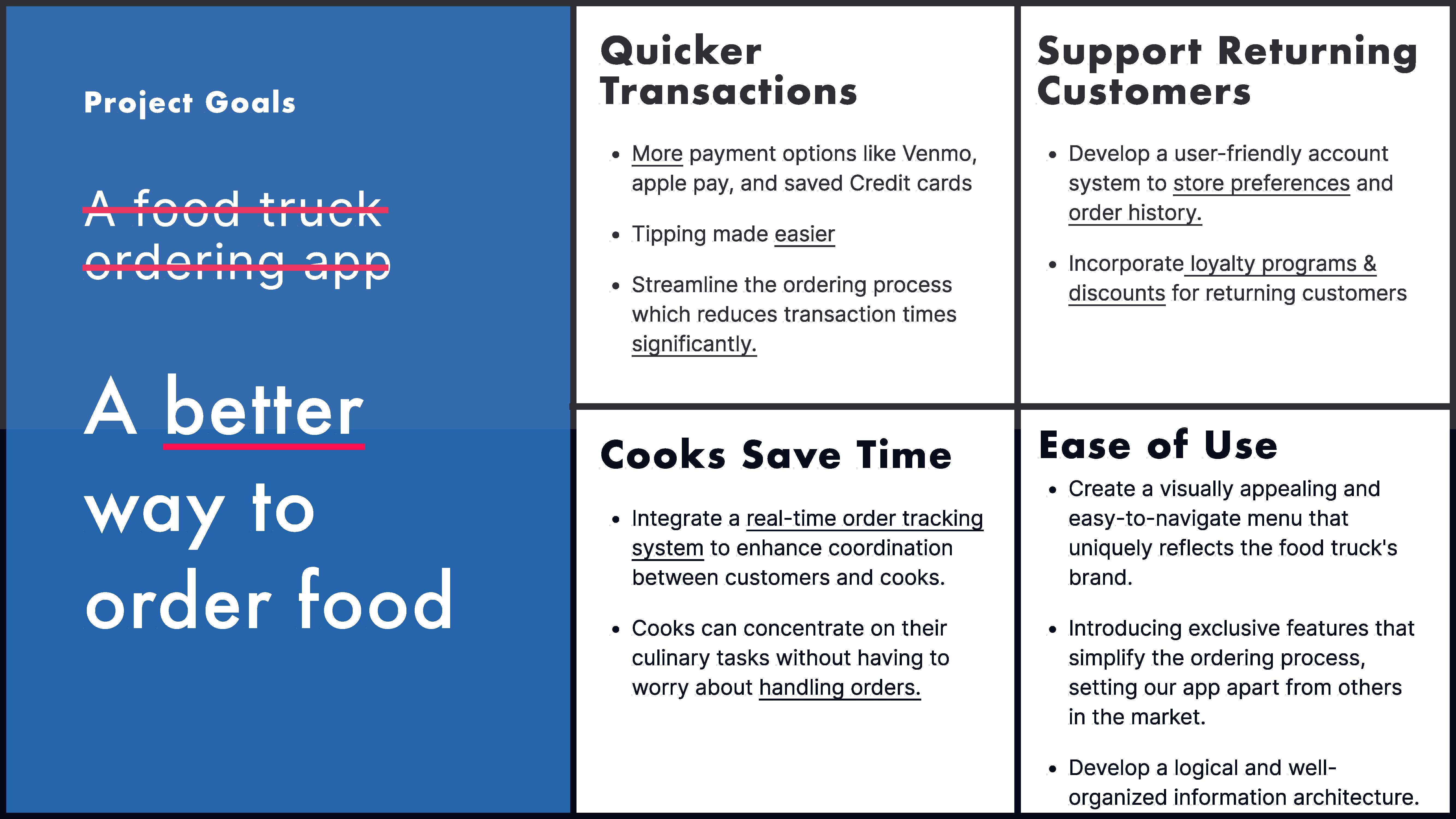
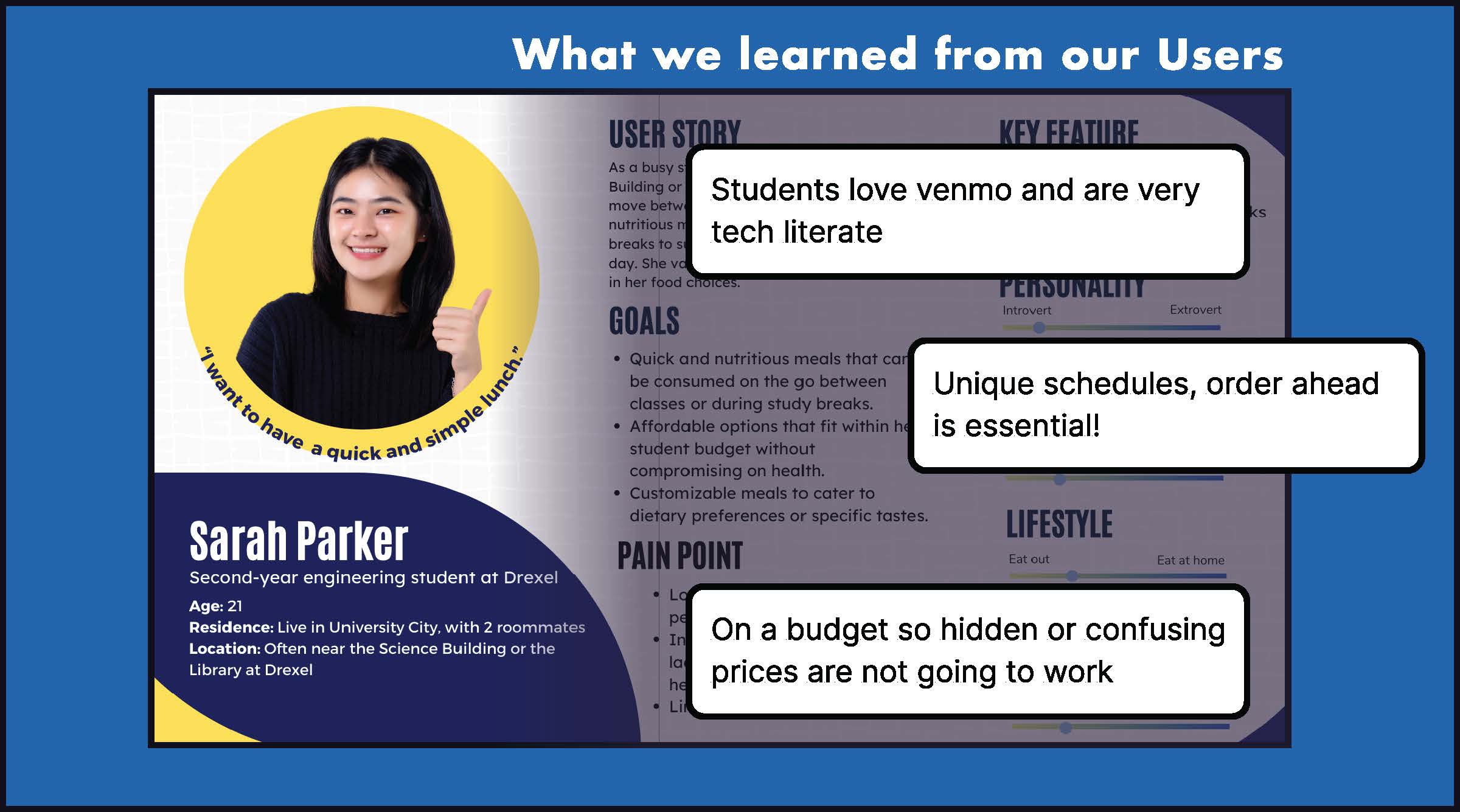
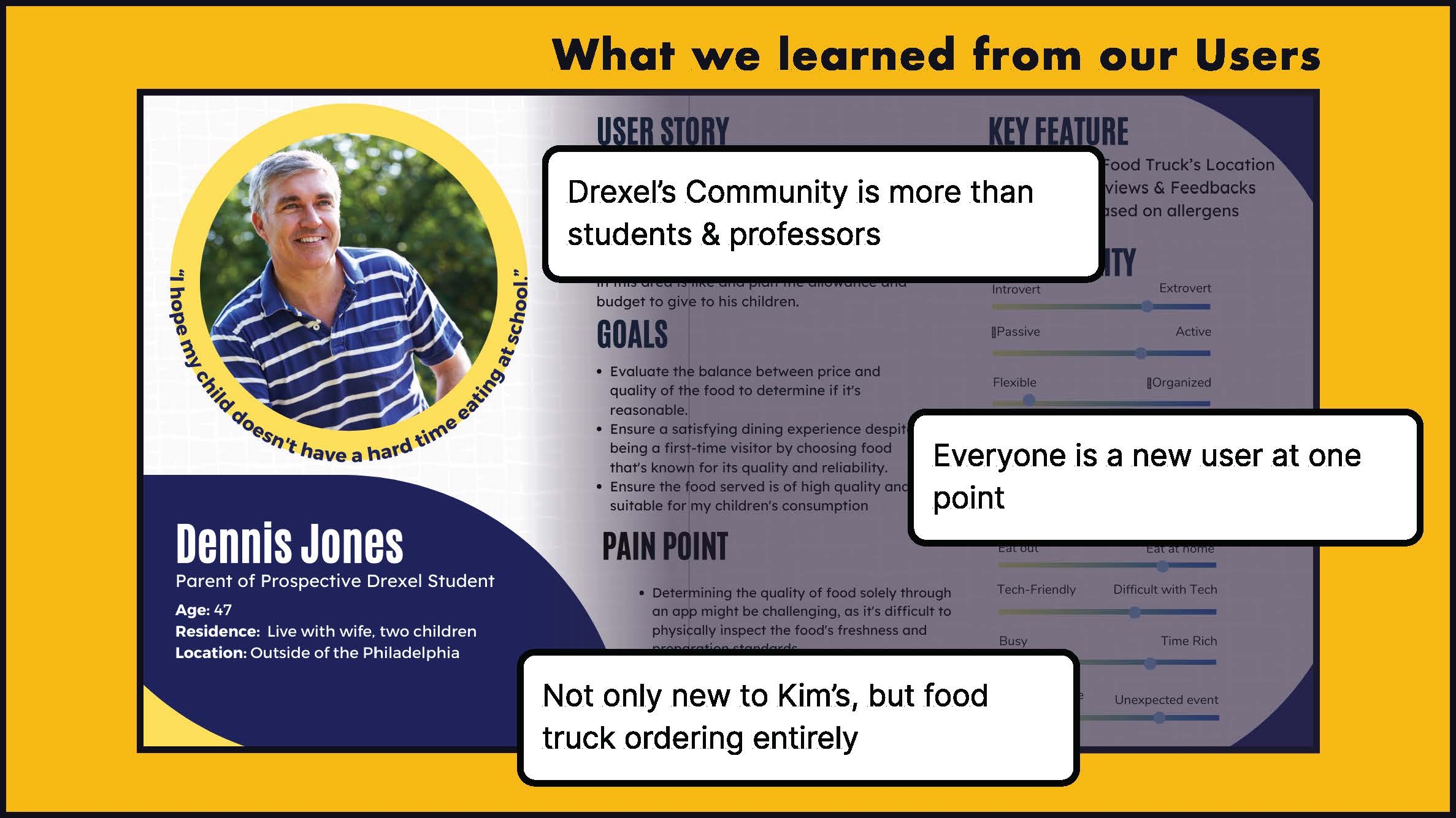
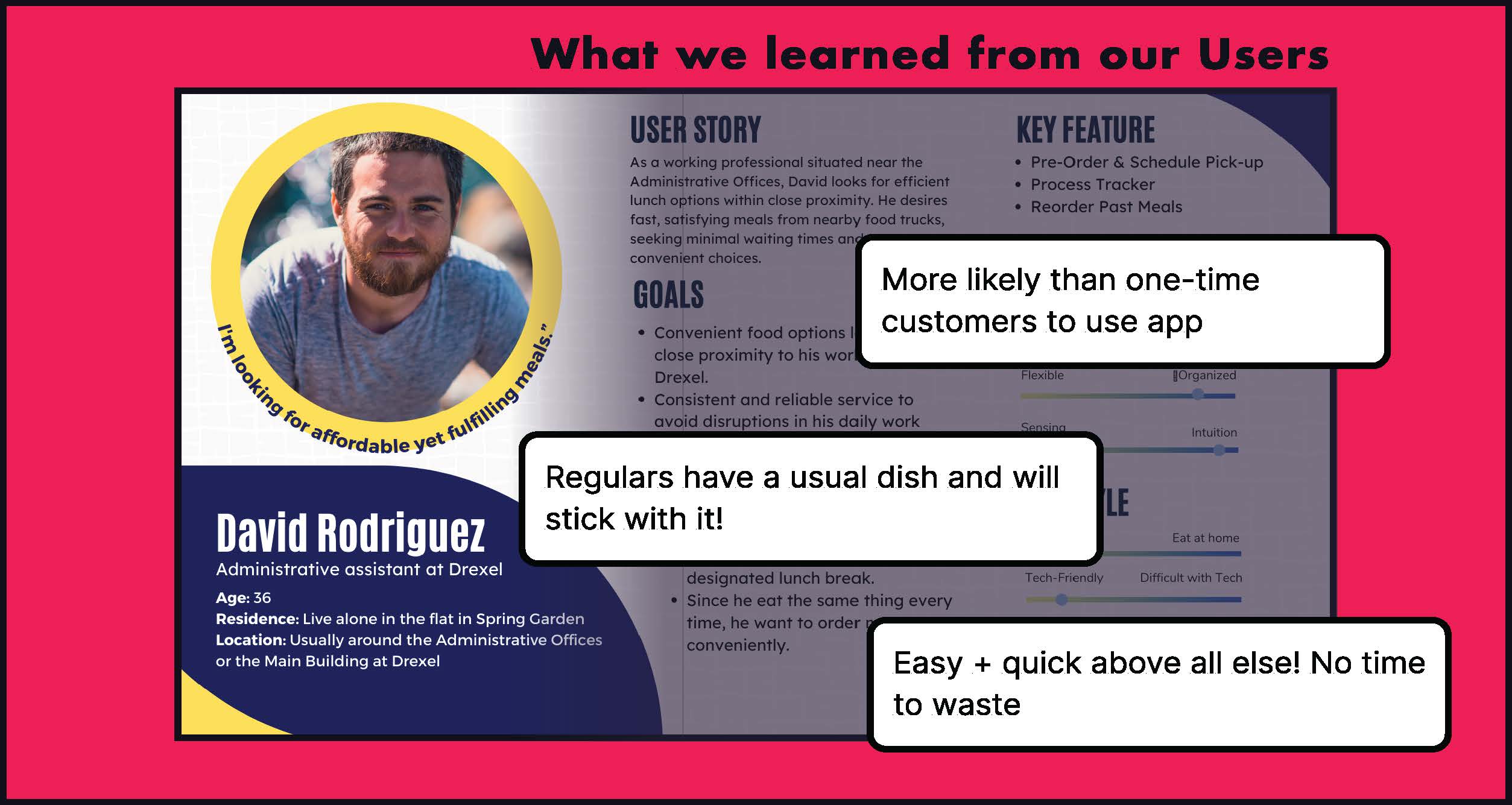
Process and Insight
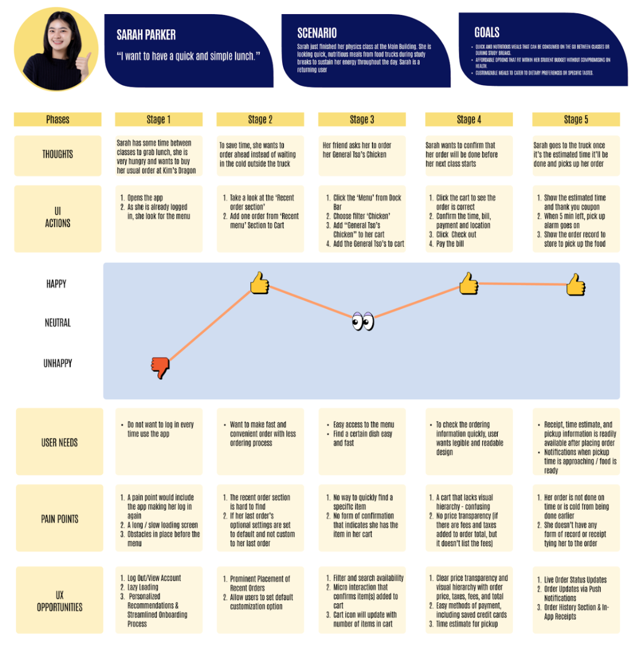
User Personas
Our first point of action was to conduct some observational testing
and field interviews at Kim's Dragon in order to gain a better
understanding of the types of users this app will be for. After a few
days of our initial testing we had a few solid takeaways.
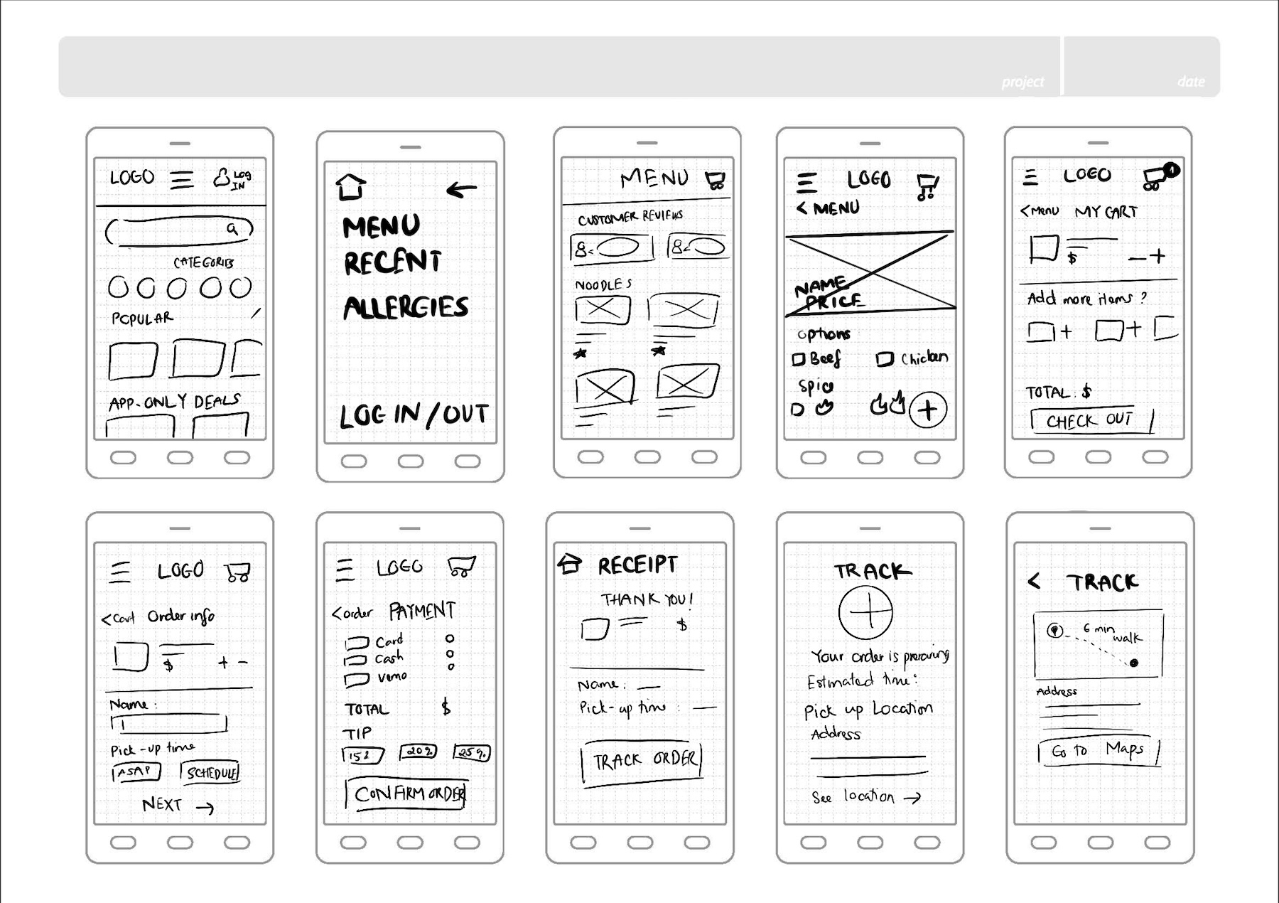
Design Sketches
In working through sketches, we took inspiration from pre-existing
food ordering apps. While we want to have an outstanding app, we also
want to have an app that anyone can use, this meant that we had to
design for familiarity while also being unique.
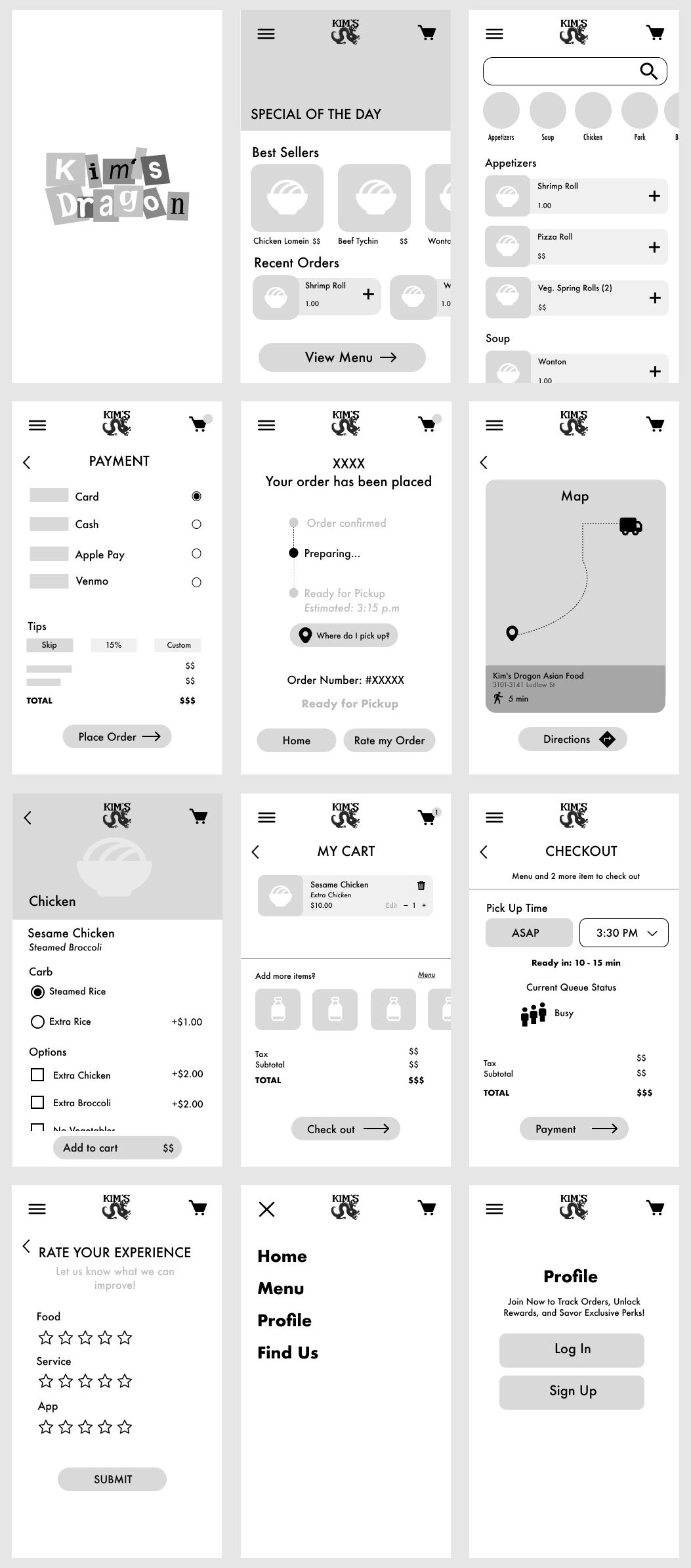
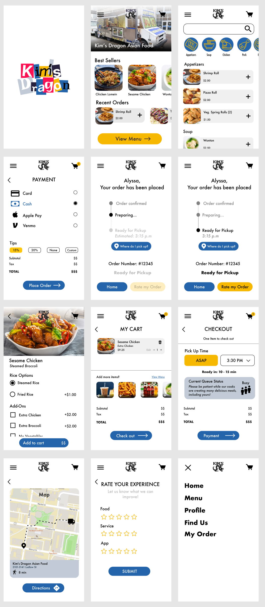
Mid Fidelity Prototype
With our first round of testing complete, we had plenty of good
feedback to work with. Along with changes made based on our
feedback, we added color, imagery, and iconography to our mid
fidelity prototypes.

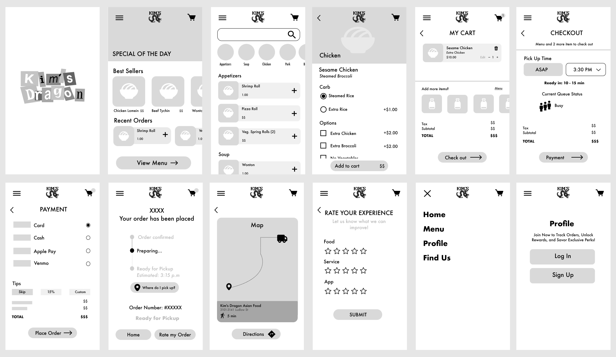
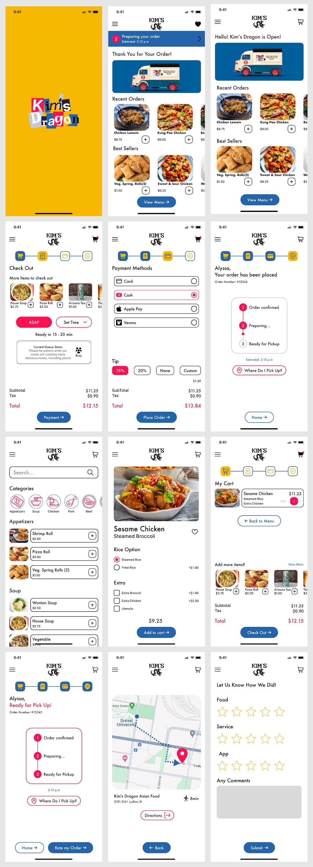
Testing Takeaways
With our second round of testing, we upgraded our prototype to mid
fidelity, including images, more detailed copy, and color. This
broadened the amount of valuable feedback we were able to get from
our testers:
-
When on the homepage users felt that they were inside a restaurant
page of a larger food ordering app. We needed to ensure that it
was clear to users they were in Kim's Dragon's app and not a more
general app like Uber Eats or Doordash.
-
The contrast between the yellow and blue of our new menu category
iconography wasn't great enough. We needed to reassess the color
selection to bring more clarity to our icons.
-
Users struggled to identify where they were in the process of
checking out (we have it split up across multiple pages to refrain
from overwhelming the user). We saw a good opportunity here to add
a progress bar at the top of the checkout pages to inform the user
where they are in the process and allow them to easily navigate
between pages as needed.
-
We noticed confusion in certain information hierarchies as users
completed their tasks within our prototype. This was a good
opportunity to incorporate another, louder color into our design
that could indicate functions of importance that could guide the
user in their journey.
-
Users found that once they ordered their item and returned to the
menu, there was no indication that they ordered anything. This was
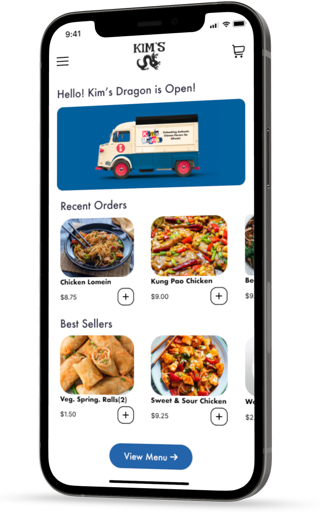
an opportunity to add an anchored banner to the top of the home
page that updated the user on their order's status and provided a
place to easily return to the order confirmation page.
The Results
Working as a team taught us various important lessons vital to our
success on this project and future projects.
An area that challenged our team was balancing familiar features and a
uniqueness to set it apart from other restaurants or food ordering
apps. While mental models are incredibly important for making it easy
for users to learn and use an app, they can also be balanced with
personality unique to a restaurant. Initially, our team focused more
on emphasizing familiar features and less on giving it a unique flair.
Towards the end of the term, we were able to key core functionality
with Kim's Dragon-specific style.
Defining essential features and tasks was crucial to prioritizing and
scheduling. We found that features like the checkout process and menu
navigation were way more critical to complete and focus on than the
rating system. Realistically, we didn't have an infinite amount of
time to complete the project, so assigning different priority levels
to different tasks was very helpful in terms of organization.
Another lesson learned was how details, regardless of how small, can
positively or negatively impact perception. During our testing, some
users commented on how a less than smooth page transition would
confuse them or take their attention away from other parts of the app.
Even details such as a button height being slightly larger or smaller
could distract a user and become more memorable than the parts of the
app they enjoyed. There were design elements that had to be tediously
edited and observed until they were no longer distractingly different.
The project was an overall success. Throughout the testing process,
when asking testers if this app would be easier than ordering in
person, participants answered yes much more confidently as the weeks
went by. Key features added to the app also seemed to stick out as
particularly helpful to Kim's Dragon customers such as current and
estimated queues that informed of current or expected wait times based
on the time of their order. The other option that helped fulfill our
goal was the addition of the order ahead feature. This served users
who had tight schedules and little time to waste. This app effectively
accomplished its core objective of making ordering great food more
enjoyable and easier.